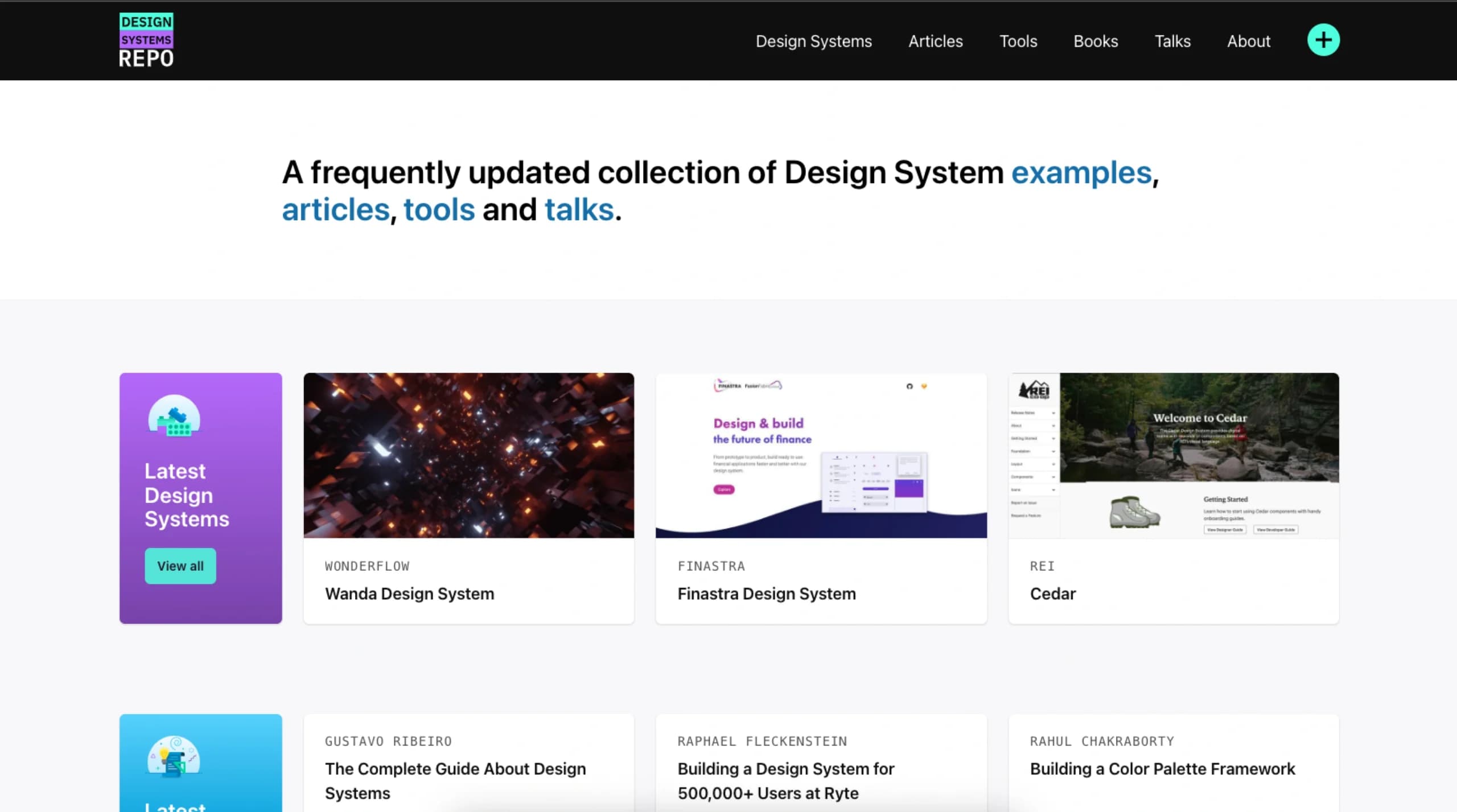
A curated GitHub repository is gaining traction by aggregating the official design systems of major technology companies into a single reference point. The repo, awesome-design-systems, lists the UI frameworks, component libraries, and style guides from firms including Google, Shopify, IBM, GitHub, Atlassian, Salesforce, Stripe, and Airbnb.
For front-end engineers, UI/UX designers, and product teams, this collection eliminates the need to manually search for each company's public design documentation. It acts as a structured index to study implementation patterns, accessibility standards, and design philosophies at scale.
What's in the Repository
The repository organizes entries by company, with each entry detailing what the respective design system includes. According to the source, typical listings cover:
- Components: Reusable UI elements (buttons, modals, forms) with code examples.
- Voice & Tone Guidelines: Content strategy and brand communication rules.
- Designer Kits: Figma, Sketch, or Adobe XD assets for designers.
- Source Code: Links to the actual component libraries (often React, Vue, or Web Components).
Notable systems featured are Google's Material Design, Shopify's Polaris, GitHub's Primer, IBM's Carbon Design System, and Salesforce's Lightning Design System.
Context and Utility
Design systems are foundational to modern software development, especially for large organizations. They enforce visual and functional consistency, improve developer efficiency, and streamline the design-to-code handoff. While these systems are publicly documented by their creators, they are scattered across different domains and documentation sites.
This repository, which had garnered 18.9k stars on GitHub at the time of the source tweet, centralizes these resources. Its primary value is for:
- Teams building their own design system: Providing a catalog of industry best practices and implementation choices to inform their architecture.
- Developers evaluating technologies: Offering a quick way to audit the component APIs and design logic of systems they might adopt.
- Designers and engineers seeking inspiration: Allowing for comparative analysis of how different companies solve common UI problems.
gentic.news Analysis
This repository highlights a mature, infrastructural phase in front-end development and AI-adjacent tooling. The curation of enterprise-grade design systems reflects their status as critical, standardized infrastructure—akin to how model hubs like Hugging Face organize machine learning artifacts. For AI engineering teams building user-facing applications (model playgrounds, data annotation tools, monitoring dashboards), a robust design system is non-negotiable for maintaining velocity and polish.
The trend of "awesome" curated lists on GitHub (awesome-react, awesome-ml, etc.) serves as a community-driven alternative to formal documentation portals. Their success depends entirely on maintenance and accuracy, as these systems evolve. Practitioners should use this repo as a starting point for research but should always verify links and check for the latest versions directly from the source.
From a tooling perspective, this connects to the broader movement of AI-assisted UI development. Companies like Vercel (with v0) and Builder.io are pushing generative UI tools that often rely on or output components compatible with these established design systems. A developer using an AI to generate a Shopify-style component would need the Polaris system as a reference for both the AI's training and the output's validation. Thus, centralized resources like this repo indirectly support the development and benchmarking of UI-generating AI models by providing a clear corpus of high-quality, production-tested component patterns.
Frequently Asked Questions
What is a design system?
A design system is a collection of reusable components, guided by clear standards, that can be assembled to build applications. It combines code (component libraries), design assets (UI kits), and documentation (usage guidelines, principles) to ensure consistency and efficiency across a product's development.
Is the awesome-design-systems repo official?
No, it is a community-curated list, not an official publication from the featured companies. It serves as an aggregator and index. You should always consult the official documentation (linked in the repo) for the most accurate and up-to-date information when implementing a specific system.
How is this useful for AI/ML engineers?
ML engineers increasingly build internal tools, model deployment interfaces, and data labeling platforms. Using an established design system accelerates front-end development for these applications, ensuring a professional, accessible, and maintainable UI without requiring deep front-end expertise. This repository helps them quickly evaluate which system's visual language and component API best fits their project's needs.
What's the difference between a design system and a component library?
A component library is the coded implementation of reusable UI pieces (like a React button component). A design system is broader: it includes the component library but also encompasses the design principles, brand guidelines, voice and tone rules, and the processes for using and contributing to the system. The library is a part of the system.